How Dalle 2 AI inspired logo for VoidQuark

When I started the VoidQuark website, I thought about what kind of logo would be appropriate. I immediately thought why not try AI?
The only thing I knew and wanted was the simple logo. On the market exist multiple AI which could generate images from the text.
I want to mention a few of them.
- Dalle 2
- Midjourney
- Stable Diffusion
- NightCaffe AI
Why I chose Dalle 2
During my testing, Dalle 2 proved what I did not expect and exceeded my expectations. The creativity in some of the images was really spectacular. Even so, I didn't have high expectations because "Void Quark" is not a word like "Spaceship".When you imagine "Spaceship", images pop up in your head.So what could "Void Quark" actually look like? Dalle 2 found an answer for me.
How to use Dalle 2
The interface is simple and intuitive. Currently supports the following features:
- Phrase - Write a phrase and it will generate 4 images.
- Variations - This option will generate 4 different variations from the original.
- Edit - This helps you to modify the existing image and apply the expected changes.
- Upload - You can upload any image and write a phrase. Based on your phrase, the generated image will change.
Let's generate a logo
an icon of particle in light green metallic iridescent material, 3d render isometric perspective on dark background
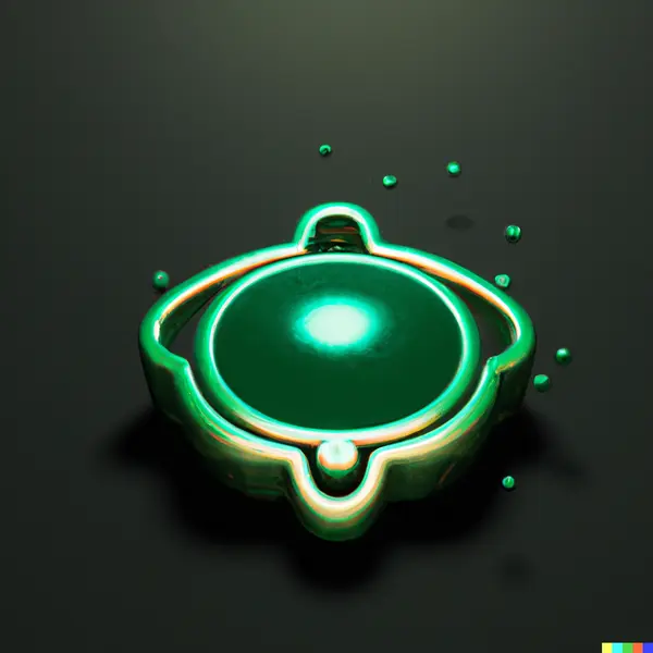
an icon of quark in light green mettalic iridescent material, 3d render isometric perspective on dark background
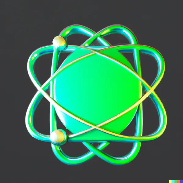
This one seemed too ordinary to me. You can find many of these on the Internet.
the void, digital art, logo, quark in a dark circle as the background

This one looks interesting, but I couldn't imagine it as a logo. I can imagine it on the wall without the letter "V".
an icon of a quark particle entering the void , digital art, logo
Something great again, but I still couldn't imagine it as a logo.
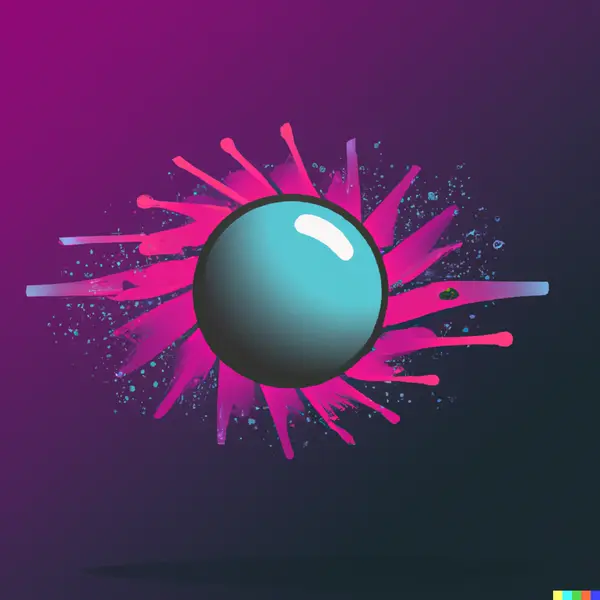
particles trapped in the void energy, digital art, logo
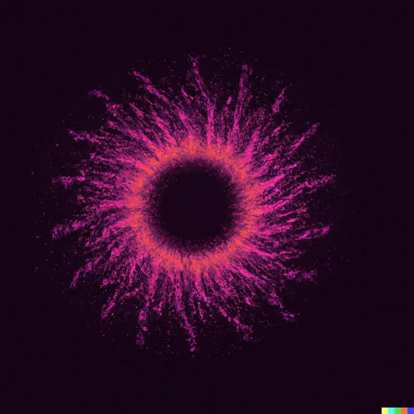
Sometimes it happened that I used the same phrase 5 or 10 times and the result was useless. I chose at least one that was worth it.
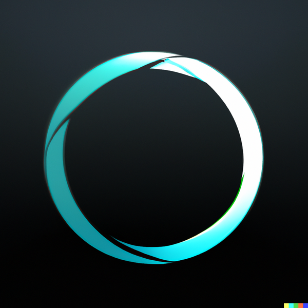
App icon of trapped void energy, digital art, logo

I really liked this, but once again the lightning seemed like something common and ordinary.
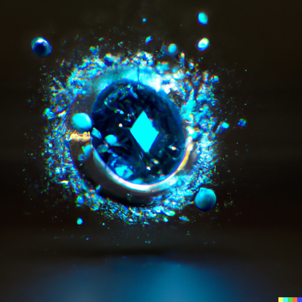
Void Quark, digital art, logo, in a dark circle as the background
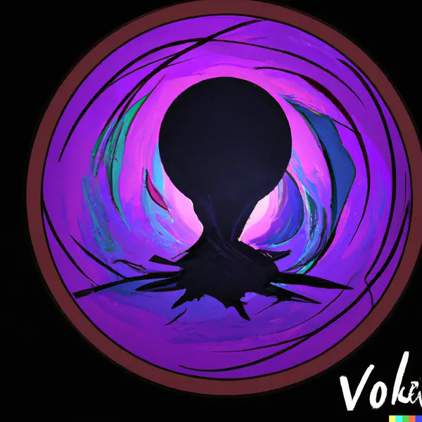
The image looks good from an art point of view. I achieved this after about 10 generations and each generation generated 4 different images. I was still not satisfied with the result.
A few more images using different phrases:
Finally, something I wanted
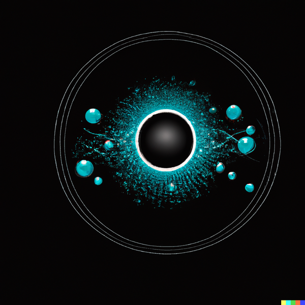
Void Quark, logo, digital art, in a dark circle as the background

I saw potential in this picture. I tried to generate other variations because sometimes the result looks completely different.

The result surprised me because I liked this one even more. I tried the "edit" option where I deleted the letter "V" and then generated other variations.
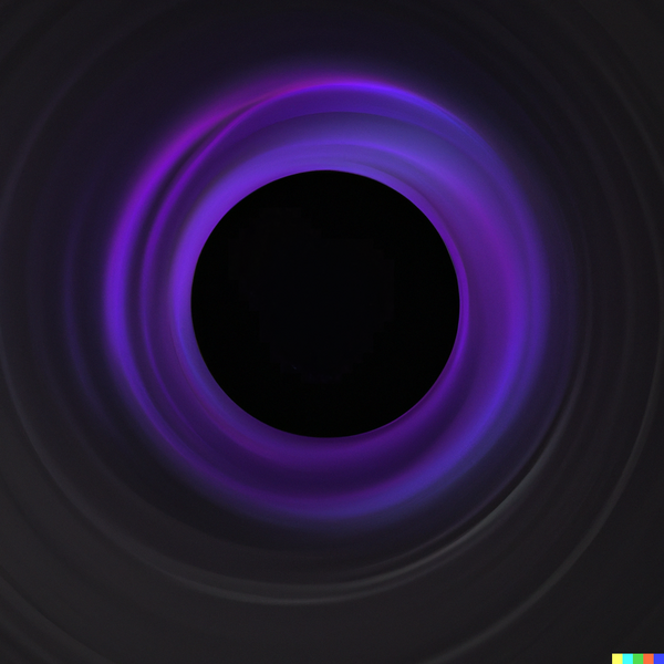
The final image that I like the most. 💜
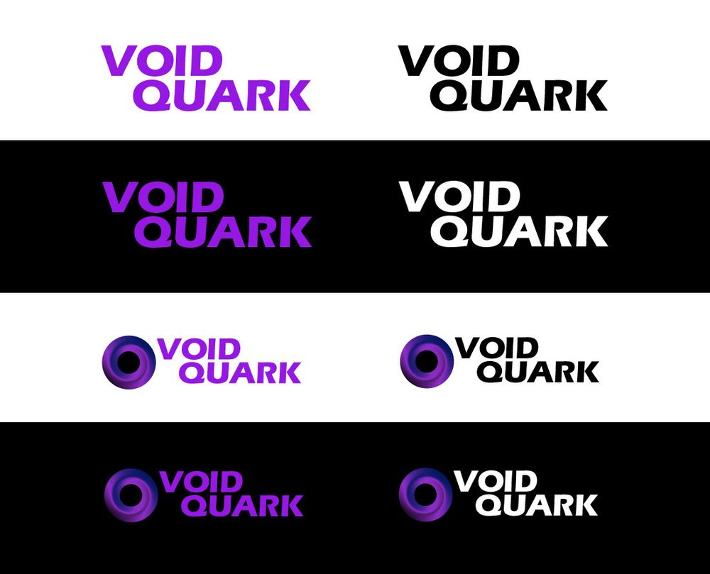
My idea of how the logo should look came true. Now it was important to turn the AI image into something real and usable. The graphic designer knew what I wanted based on the AI image and therefore created several variations.
The resulting variation:
I can't thank only the graphic designer because that would be impolite. Many thanks also to OpenAI Dalle 2 for the great results. 🦾🦾
I think that AI can help with graphics design. It can easily turn a difficult idea into something real. Don't be afraid and just try it. I want to add that this final logo generated by AI took approx 80 generations with different phrases.
Thanks for reading. I'm entering the void. 🛸 ➡️ 🕳️